This article is not about predicting the next big thing in web design. Why? For the simple reason that design trends are mostly witnessed. Rarely predicted. So just think of this blog entry as a meteorological forecast of the “web weather” that appears to be blowing our way in 2014.
Flat Design with a Chance of Scattered Colors
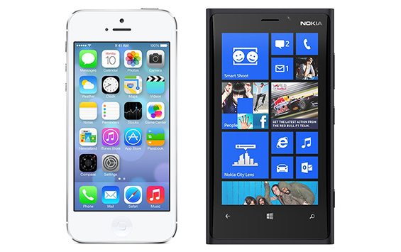
This design trend first made itself conspicuous with the latest Windows operating platform. It boldly thumbed its nose at the shiny 3-D iconography of the Apple world. So what did Apple do? They followed suit. Witness the recent flattening out in the graphics of the latest iPhones. Say goodbye to glows, gloss, gradients and wood grain. Flat is where it’s at.
A Responsive Blizzard
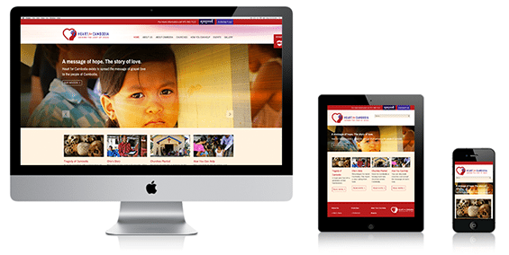
Websites will continue to be simpler, cleaner and more mobile friendly thanks to responsive design. All new 2014 websites will be adopting this ingenuous means of making sites seamlessly perform on desktops, tablets and other mobile devices. Not a prediction, just a fact.
More Scrolling. Less Clicking. Dress Warmly.
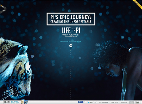
Today’s web user is now so use to scrolling on their smartphones and tablets that it has become second nature. Plus, mobile device speeds have increased to the point that scrolling is simply faster than clicking. Long scrolling sites, with well-organized content and sophisticated jump navs will become more common in 2014.
Scroll Activated Animation. Gloves Optional.
Website designers will continue to plumb the depths of these interesting transition effects that activate as you scroll past them. Warning: a little of this can go a long way. Don’t go crazy.
Less Reading. More Watching. Feel the Breeze.
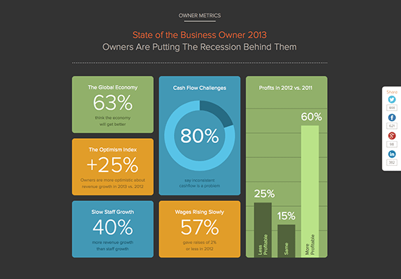
Websites will continue to recognize that the bots are more interested in reading their copy than most humans. Consequently, visual content like videos, gifs and infographics will play a bigger and bigger role. Big, encompassing background videos are something else to keep an eye on.
A Typographic Typhoon
Web-safe fonts used to consist of Arial, Courier and something called Times. But those days are long gone. Thanks to Google fonts and Typekit, websites can be as on-brand as anything else in the marketing toolbox. Today, web-safe typeface choices are limitless. Batten down the hatches.
Keeping an eye on design trends is just part of the equation. An effective web plan encompasses strategy, analytics and more. If your website is not all that it should be, give us a Toll Free call at 866.642.7559. We’d love to make it shine.
We are a Dallas Advertising Agency specializing in integrated marketing and web design.
