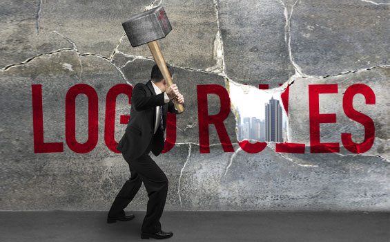
If your company or startup is on a quest for a new logo design, the Internet is chocked full of well-intentioned advice. However, many of the logo design tips you’ll encounter can prove to be inherently myopic. After all, your brand is unique, your story is unique and no rule of thumb can fully address every dimension of your brand messaging and personality.
So take a moment and let’s consider some of the logo design rules that you may want to consider breaking.
Keep it simple
This logo design advice is golden. By and large, the best logo designs are clean and simple, avoiding detail. The Shell Oil shell, the McDonalds arches, the Nike swoosh or even the NBC peacock. Clean, simple, not a lot of moving parts. But sometimes the character of brand requires something a bit more ornate or old world. Think of the Oroweat ribbon, The Metro Golden Mayer Lion, the Jack Daniel’s placard or the Porsche shield. These are powerful and recognizable trademarks that communicate something very important about the brand’s heritage, personality and overall gestalt.
No more than two colors
This is also a great logo design rule of thumb. Two colors are all most logos need. But sometimes the message you are trying to send is far bigger than two measly PMS color swatches. A while back, Agency Creative developed a logo for an MEP engineering firm. Their existing logo was a simple black and red affair. But our client was not your typical engineering firm. They were a right-brained, extremely creative group of engineers that liked to color outside the lines. So we developed a new logo for them using pretty much every color in the Crayola box. The new logo leapt off the page to help our client stand out from the pack. Clothing manufacturer, Land’s End, liked the logo so much that they featured it in one of their catalogues to demonstrate they were not afraid to tackle multi-color designs–free advertising.
Design something timeless
This is a great rule, for trends and fashions come and go. However, something like the classic Coca-Cola logo is hardly a timeless design. It looks like the era it was designed in. What makes the logo endured is the brand’s relentless refusal to update this logo to something cool or trendy. Stand your ground. Not every logo needs to be updated. Unless, of course, you’re Pepsi.
Always hire a pro
This is generally great advice, a quality logo rarely come from amateurs. But just know this: there have also been great exceptions to this rule. Carolyn Davidson was a student at Portland State when she was offered $35 to design a logo for a nascent company called Nike. The result is one of the most enduring and recognizable marks in the world–the Nike swoosh. Fortunately for this neophyte designer, she later received some 500 shares of Nike stock. Not bad for an amateur.
Pick an appropriate palette
This is another two-edge sword. Ever noticed how many political logos are red, white and blue? Ever observed how many lawn care products have green in their logo? Color palettes have significance. A green logo on a package of frankfurters makes the meat seem a bit off. But, of course, if you only stick to conventions, your logo colors will look just like your competitors’. Consider using the colors the other brands are afraid of. Think of FedEx. Their logo palette majors on the color purple-a color most brands are afraid of. Be bold or be left behind.
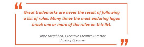
These rules are not wrongheaded, just shortsighted. As you evaluate a new logo keep them in the back of your head. But remember this, great trademarks are never the result of following a list of rules. Many times the most enduring logos break one or more of the rules on this list. If you need a resource to help you come up with an impactful logo design give us a call at 972.488.1660.
Artie is executive creative director for Agency Creative. His full-time passion is giving brands their unique memorable voice. He and his co-conspirators would love to help your company stand out from the crowd. See more of his creative work.
We are a Dallas Advertising Agency with expertise in Integrated Marketing.
